Here's a great short film by comedian Louis C.K. I like a lot of things about this- the simple shots, the use of black and white, and just the absurd, almost silent way the story is told.
Another one I love is the video of Eartha Kitt singing "I Want To Be Evil". I like how simply its shot- there's basically only that straight-on view of her face, and her expressions are lively and animated enough to carry the whole thing.
Monday, January 19, 2009
Friday, January 16, 2009
The Ladies' Man
In class on Wednesday, we watched the movie Delicatessen, which was done by the same director who did Amelie. I kind of hated Amelie, because I can only take so much whimsy in a movie. I liked this one better, because at least it was dark enough to offset the whimsy. There were still some things that bugged me, but I'm glad I saw it.
Talking about movies with invented sets made me think of one of my favorite movies, for which the director and star Jerry Lewis constructed the largest indoor film set of all time.
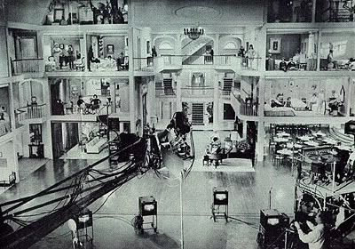
Jerry Lewis is kind of considered a joke now, if he's even remembered at all. But at one time he was an excellent comedian, and an incredible dancer. His old variety show with Dean Martin, which he did when he was my age, is really amazing to watch. When he became a director, though, he was surprisingly innovative. He invented a lot of tools used in filmmaking today, such as the picture-in-picture video assist.
When he made his film The Ladies' Man, he constructed an elaborate sixty-room set and an elevated director's chair so he could go from room to room in one shot. And each of the rooms themselves were visually striking and color-coordinated in their own way.
Here's one of my favorite scenes, which introduces a character named "Mrs. Cartilage", who lives in "the forbidden room."
Talking about movies with invented sets made me think of one of my favorite movies, for which the director and star Jerry Lewis constructed the largest indoor film set of all time.

Jerry Lewis is kind of considered a joke now, if he's even remembered at all. But at one time he was an excellent comedian, and an incredible dancer. His old variety show with Dean Martin, which he did when he was my age, is really amazing to watch. When he became a director, though, he was surprisingly innovative. He invented a lot of tools used in filmmaking today, such as the picture-in-picture video assist.
When he made his film The Ladies' Man, he constructed an elaborate sixty-room set and an elevated director's chair so he could go from room to room in one shot. And each of the rooms themselves were visually striking and color-coordinated in their own way.
Here's one of my favorite scenes, which introduces a character named "Mrs. Cartilage", who lives in "the forbidden room."
Tuesday, January 13, 2009
Movie Posters
I want to write and draw comics, but I think movies are what I'm most passionate about as a fan. I also really like a lot of movie posters, and here are some of my favorites.
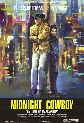
Midnight Cowboy
This is one of my top favorite movies ever, but that's not why I like the poster. I think I like it because New York tends to be depicted as a very grey, dark place in paintings. I grew up in New York and I never thought that was a good way to show it. I like this poster because it makes New York look bright and colorful and full of energy. The two main characters look a little overwhelmed, like they're stranded in all this light and movement- which is a pretty good summary of what the movie is. I also like how, despite the bright colors, the expressions on their faces are still grim and sort of hopeless. I think it's kind of a cheat to use faded, dark colors to convey those moods.
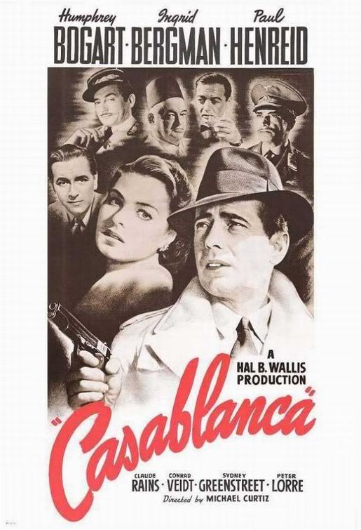
Casablanca
I really like these old style posters, which show the faces of the cast kind of floating in space. Its strange how little things like the way the title is written, and the slightly red tint of the whole thing, can make the image so unique, even if many posters might have a similar format. I also like Bogart's facial expression. He looks like he's running, or maybe deciding whether he needs to fire his gun or not. He looks kind of scared, even. Today in movie posters, if a guy is holding a gun, he looks determined and steadfast and badass. I think Bogart's face in this poster shows a lot more urgency and excitement. I think that modern posters of a guy with a gun walking grimly towards the viewer just look boring and static, which is why I like this one so much.
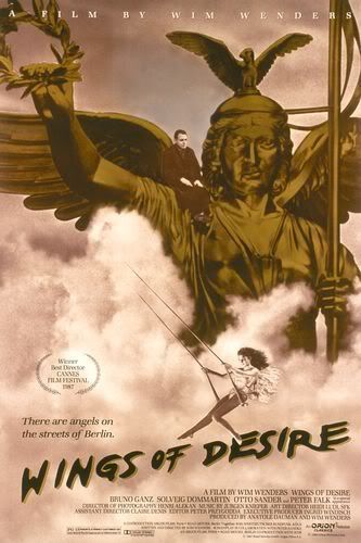
Wings of Desire
This is from a german film about a guardian angel who falls in love with a human. The way the angels are shown in the movie is really subtle and nice. They're just middle-aged men in dark coats, and you only see their wings briefly. I like how this poster makes the movie seem kind of epic, with the trapeze woman swinging through the clouds, and the statue rising up like it could fly. But then you notice the little man sitting calmly on the shoulder, like he's worried about something, and you focus on that, and it sort of brings you back down. That's sort of what the movie is like- it's about these big, epic things like angels and mortality and good and evil, but the actual story is very small and subtle.
I want to write and draw comics, but I think movies are what I'm most passionate about as a fan. I also really like a lot of movie posters, and here are some of my favorites.

Midnight Cowboy
This is one of my top favorite movies ever, but that's not why I like the poster. I think I like it because New York tends to be depicted as a very grey, dark place in paintings. I grew up in New York and I never thought that was a good way to show it. I like this poster because it makes New York look bright and colorful and full of energy. The two main characters look a little overwhelmed, like they're stranded in all this light and movement- which is a pretty good summary of what the movie is. I also like how, despite the bright colors, the expressions on their faces are still grim and sort of hopeless. I think it's kind of a cheat to use faded, dark colors to convey those moods.

Casablanca
I really like these old style posters, which show the faces of the cast kind of floating in space. Its strange how little things like the way the title is written, and the slightly red tint of the whole thing, can make the image so unique, even if many posters might have a similar format. I also like Bogart's facial expression. He looks like he's running, or maybe deciding whether he needs to fire his gun or not. He looks kind of scared, even. Today in movie posters, if a guy is holding a gun, he looks determined and steadfast and badass. I think Bogart's face in this poster shows a lot more urgency and excitement. I think that modern posters of a guy with a gun walking grimly towards the viewer just look boring and static, which is why I like this one so much.

Wings of Desire
This is from a german film about a guardian angel who falls in love with a human. The way the angels are shown in the movie is really subtle and nice. They're just middle-aged men in dark coats, and you only see their wings briefly. I like how this poster makes the movie seem kind of epic, with the trapeze woman swinging through the clouds, and the statue rising up like it could fly. But then you notice the little man sitting calmly on the shoulder, like he's worried about something, and you focus on that, and it sort of brings you back down. That's sort of what the movie is like- it's about these big, epic things like angels and mortality and good and evil, but the actual story is very small and subtle.
I thought I had posted a progress image of my third collage, but I guess I didn't. So here it is (I've chosen to do paintings of this one and the salamander one.)
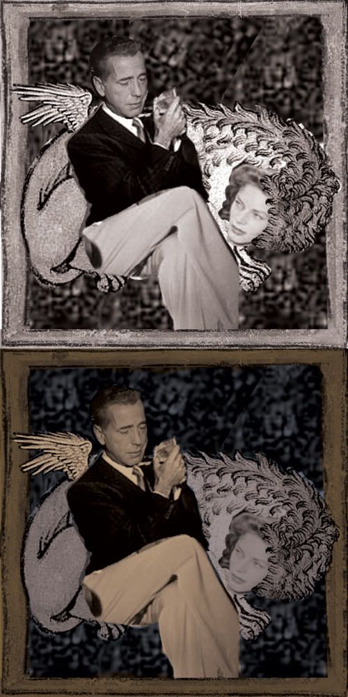
I really like the idea of putting classic move stars and other celebrities with ancient holy imagery of the past. In freshman year drawing class, I did a whole series on this idea, except it was tarot cards.
I'm still working on the paintings and having kind of a hard time. I haven't oil painted in almost a year. Last semester I got very accustomed to using wax pastels on masonite. I sort of wish I could use that for this class too. I think I'd be a lot more comfortable. But this is a painting studio, so. Maybe I'll get better as I go on. I was never awesome at oil paint, but I think I was at the level just above "competent". Like, not good, but not at the "learned how to do this yesterday" stage. Oh well.
Friday, January 9, 2009
Second Collage
I resized this one more so it would fit on the blog:
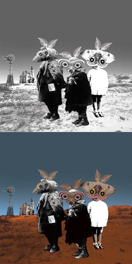
I actually like the black and white version better. If I do a painting of this one, I might do it in grayscale or sepia or something.

I actually like the black and white version better. If I do a painting of this one, I might do it in grayscale or sepia or something.
Work in Progress, Paintings I like
Here is the work in progress on one of the collages I'm doing for the first assignment. I decided to do them digitally since we'll be painting them and I feel I have more control this way. Here is the b/w version (I changed the photos I used to b/w, adjusted the contrast, then put them together) and the one with color added.
Click to open in new window
In the painted version I will try to make up the contrast to give it more of a sense of depth. I tried to do that with the color but it didn't work as well as I hoped. I'll also try to make it clear that the salamanders are on top of each other, not just on separate planes. I want this to look more physical than it looks now.
Paintings I Like
Sunday, Edward Hopper
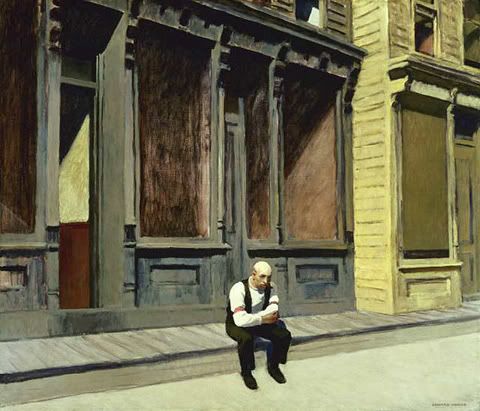
This is one of my favorite Hopper paintings. I like how the man seems so isolated, but he doesn't seem particularly lonely or sad, he just looks like he's sort of enjoying a moment by himself. I also love the colors on the building behind him- the dark grey blue, and the sort of ashey red windows- and the way he's able to paint dark shadows but still imply kind of a bright morning.
Coffee Sketch, Rene Engstrom
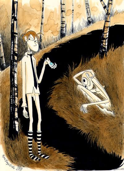
This was a watercolor sketch that was finished in coffee when the artist ran out of water. I like how otherworldly this image is, but how the character's expressions are still sort of normal. I also like how Engstrom can do features so simply but still convey so much. I love the strangeness of it, but also how simple the piece is, and how unfazed both the characters look. I also like the big dark space in between them. It might be a river, but I like to think of it as just a huge shadow that doesn't really make physical sense.
I Danced My Legs Down To The Knees, Chris Onstad
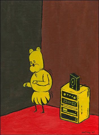
I love the colors, and how blocky and iconic this is. I like how the character appears to be dancing by himself, in a corner, just sort of bouncing up and down to the music. His expression is sort of content, but not particularly excited. It's like his mind is wandering and he's almost forgotten that he's dancing.
Click to open in new window
In the painted version I will try to make up the contrast to give it more of a sense of depth. I tried to do that with the color but it didn't work as well as I hoped. I'll also try to make it clear that the salamanders are on top of each other, not just on separate planes. I want this to look more physical than it looks now.
Paintings I Like
Sunday, Edward Hopper

This is one of my favorite Hopper paintings. I like how the man seems so isolated, but he doesn't seem particularly lonely or sad, he just looks like he's sort of enjoying a moment by himself. I also love the colors on the building behind him- the dark grey blue, and the sort of ashey red windows- and the way he's able to paint dark shadows but still imply kind of a bright morning.
Coffee Sketch, Rene Engstrom

This was a watercolor sketch that was finished in coffee when the artist ran out of water. I like how otherworldly this image is, but how the character's expressions are still sort of normal. I also like how Engstrom can do features so simply but still convey so much. I love the strangeness of it, but also how simple the piece is, and how unfazed both the characters look. I also like the big dark space in between them. It might be a river, but I like to think of it as just a huge shadow that doesn't really make physical sense.
I Danced My Legs Down To The Knees, Chris Onstad

I love the colors, and how blocky and iconic this is. I like how the character appears to be dancing by himself, in a corner, just sort of bouncing up and down to the music. His expression is sort of content, but not particularly excited. It's like his mind is wandering and he's almost forgotten that he's dancing.
Hi! My name is Magnolia Porter and I'm a junior in illustration at Rhode Island School of Design. I'll be using this blog to talk about my work in the class I'm taking this semester, Painting the Constructed World. Currently I'm working on making collages to paint. I searched for images of people holding animals because I wanted to do kind of a Good Shepherd thing, and I came across this photograph from Life magazine. I think it's pretty striking, so I'm definitely going to use it.


Subscribe to:
Posts (Atom)