Tuesday, February 10, 2009

The designs on cigarette packages are some of my favorite things ever. The use of color, the easy stylishness- everything about them is appealing. I don't smoke myself, but I come from a family of smokers, so I guess I sort of associate cigarettes with home and people I love. I'm kind of too timid to start smoking in earnest but I dislike the judgmental tone of anti-smoking ads. I figure people should do what they like, and too much of anything will kill you anyway.


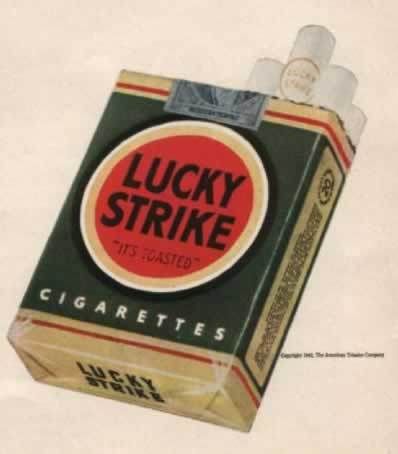
The Lucky Strike design is largely the same today, except its white instead of dark green. I sort of prefer the green, though. It almost looks homemade, and less like the Pepsi logo.


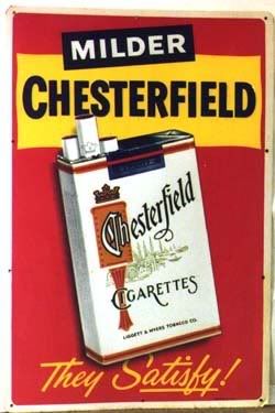
In a way it kind of makes me sad that cigarette ads aren't like this anymore. I think to be fair, tobacco companies should be allowed to advertise as vigorously as the "truth" commercials. I think it'd be funny, anyway.

The movie Thank You For Smoking used elements of these designs really well in its opening credits sequence. The interesting thing about that movie is they never actually show a single person smoking.


It's sad now that movies get a more "adult" rating if they feature smoking. It can bump a PG-13 to R, which seems to me like overreacting. The whole ratings system is messed up anyway. It's not like kids are gonna go, "Oh my god, Benjamin Button is smoking, I can't wait to get my hands on a pack!"

Monday, February 9, 2009

Here's some of the photo studies for my set I did over the weekend. I'm still working on the final painting. I think I'm going to use the ones with less total objects in them. I also want to use some bright colors, but still try to give it a less bright kind of feeling.


I'm also gonna do a couple more posts tonight and tomorrow to make up for the lack of it over the weekend.

Friday, February 6, 2009

Here are some of the images I've been looking at in preparation for my final.


I kind of want to do the "people in a room" thing again, because to be totally honest, Heesung's painting of my set is kind of an inspiration too. I really liked her rendition. It's sort of what I see in my head when I think about what kind of paintings I would like to make. So I'm going to try to do something like that, I think. I bought some small dollhouse furnishings and some real Sculpey instead of modeling clay. I have some ideas of what kind of setup I want- definitely more than one person, definitely more bright. We'll see what I come up with.

Monday, February 2, 2009


Night of the Hunter is one of my favorite movies. Partly because it has sentimental value for me, as I was named after one of the characters. And partly because its easily one of the best movies ever made, ever.

I could probably write a whole essay about this movie. Others have probably written much better essays about it then I could ever write. Because this is kind of an "art blog" I'll talk about the visuals mostly. But the story is just as good. Whenever I watch it I find it hard to stop. Some older movies are difficult to get into, no matter how good they are, but this one is really engaging to me, and sort of surprisingly complex. Here are a few images from the film. Keep in mind that this is a Hollywood movie made in 1955, half a decade before the French New Wave.


And probably the most famous shot, of Shelley Winters after her car has been pushed into a lake:


Pretty much everything about this movie is perfect, but it's also exciting to watch because you can see where all the things we find fresh and exciting about movies today got their start. The Coen Brothers probably would be accountants or something if this movie never existed. It used to be on Hulu but it doesn't seem to be available anymore, but its definitely worth the cost of a rental.