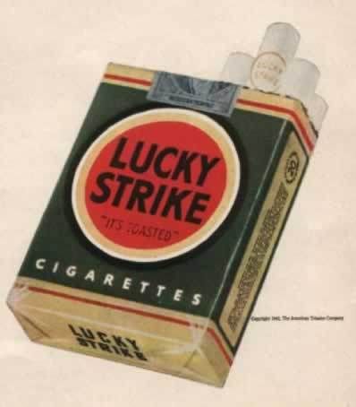
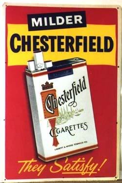
The designs on cigarette packages are some of my favorite things ever. The use of color, the easy stylishness- everything about them is appealing. I don't smoke myself, but I come from a family of smokers, so I guess I sort of associate cigarettes with home and people I love. I'm kind of too timid to start smoking in earnest but I dislike the judgmental tone of anti-smoking ads. I figure people should do what they like, and too much of anything will kill you anyway.
The Lucky Strike design is largely the same today, except its white instead of dark green. I sort of prefer the green, though. It almost looks homemade, and less like the Pepsi logo.
In a way it kind of makes me sad that cigarette ads aren't like this anymore. I think to be fair, tobacco companies should be allowed to advertise as vigorously as the "truth" commercials. I think it'd be funny, anyway.
The movie Thank You For Smoking used elements of these designs really well in its opening credits sequence. The interesting thing about that movie is they never actually show a single person smoking.
It's sad now that movies get a more "adult" rating if they feature smoking. It can bump a PG-13 to R, which seems to me like overreacting. The whole ratings system is messed up anyway. It's not like kids are gonna go, "Oh my god, Benjamin Button is smoking, I can't wait to get my hands on a pack!"
Monday, February 9, 2009
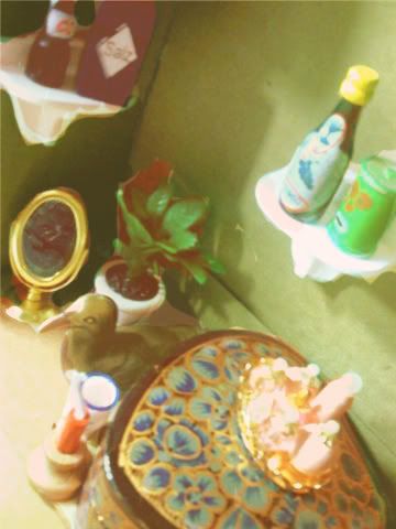
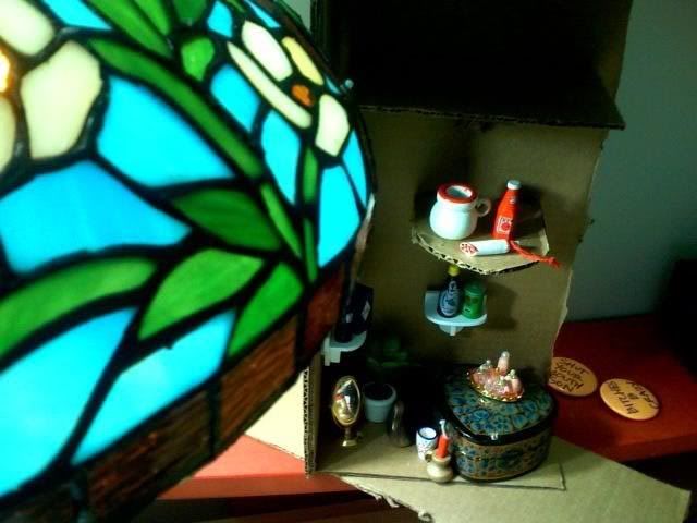
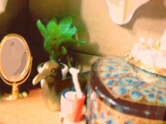
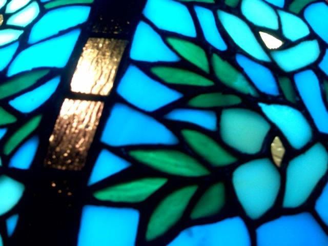
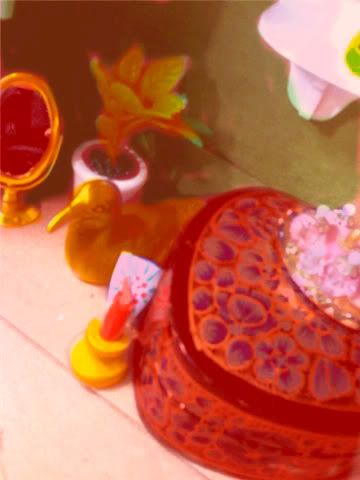
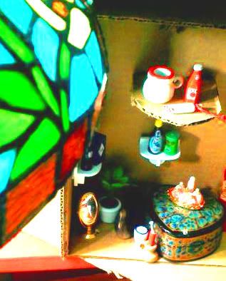
Here's some of the photo studies for my set I did over the weekend. I'm still working on the final painting. I think I'm going to use the ones with less total objects in them. I also want to use some bright colors, but still try to give it a less bright kind of feeling.
I'm also gonna do a couple more posts tonight and tomorrow to make up for the lack of it over the weekend.
Friday, February 6, 2009
Here are some of the images I've been looking at in preparation for my final.
I kind of want to do the "people in a room" thing again, because to be totally honest, Heesung's painting of my set is kind of an inspiration too. I really liked her rendition. It's sort of what I see in my head when I think about what kind of paintings I would like to make. So I'm going to try to do something like that, I think. I bought some small dollhouse furnishings and some real Sculpey instead of modeling clay. I have some ideas of what kind of setup I want- definitely more than one person, definitely more bright. We'll see what I come up with.
Monday, February 2, 2009
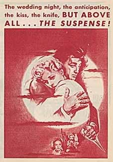
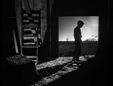
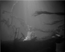
Night of the Hunter is one of my favorite movies. Partly because it has sentimental value for me, as I was named after one of the characters. And partly because its easily one of the best movies ever made, ever.
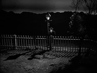
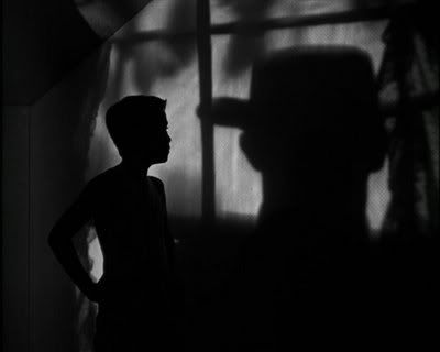
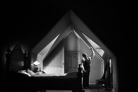
I could probably write a whole essay about this movie. Others have probably written much better essays about it then I could ever write. Because this is kind of an "art blog" I'll talk about the visuals mostly. But the story is just as good. Whenever I watch it I find it hard to stop. Some older movies are difficult to get into, no matter how good they are, but this one is really engaging to me, and sort of surprisingly complex. Here are a few images from the film. Keep in mind that this is a Hollywood movie made in 1955, half a decade before the French New Wave.
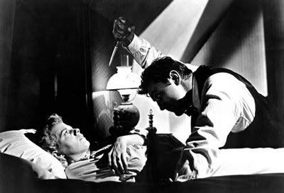
And probably the most famous shot, of Shelley Winters after her car has been pushed into a lake:
Pretty much everything about this movie is perfect, but it's also exciting to watch because you can see where all the things we find fresh and exciting about movies today got their start. The Coen Brothers probably would be accountants or something if this movie never existed. It used to be on Hulu but it doesn't seem to be available anymore, but its definitely worth the cost of a rental.
Wednesday, January 28, 2009
Irina's post about the mummified mermaid reminded me of a friend of mine, who mummified her pet rat a few years ago. Here's a few pictures she took of the process-
You can read the whole thing here, although its pretty long. I skipped a lot of the steps, also because they involve taking guts out and stuff. It's sort of gross, so view with caution. But it's also pretty cool. I might be weirded out if she did this with ALL her pets, but she doesn't. I think it was mostly done to see if she could follow the same process the Egyptians used, not because she wanted to preserve the rat forever or something.
Monday, January 26, 2009
I'm still thinking about a response post, I'll have one finished by tonight. Until then, here's another clip from a movie that uses an elaborate constructed set- Francis Ford Coppola's One From The Heart. It's kind of an infamous flop, and for good reason- the following clip is the first five minutes of the movie, and it's basically the best part of the whole thing.
The movie is set in Las Vegas, but it was shot entirely in the studio, with miniature versions of famous parts of the city. An airport and life-sized jet were even built for one of the scenes. It cost so much to put together that it completely bankrupted Coppola.
The script and the characters are pretty terrible. I watched this because I'm a big Tom Waits fan, and he wrote and performed the soundtrack for this movie (which is pretty great, and one of my favorite albums). When I saw those first five minutes, with those songs over the stylized Vegas lights and casinos, I was totally mesmerized. I thought the dialogue would have to be really, really awful to completely offset how great the music and sets were. Turns out, it was! But I still think its worth watching, because the look of the movie is so unique.
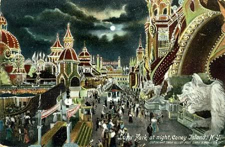
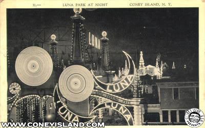
I'm thinking about what I want to do for the next set I build. I have one idea but it might take too long to get the materials I need. Another idea I have is to do sort of a rebuild of Coney Island's Luna Park (which would also take a lot of materials-gathering, but I have better ideas of how to do it). I could go to the museum and find a painting I like, and sort of incorporate the setting into it, maybe.
My thoughts on how to do that would be to use a sort of backlit background image, and then something like christmas lights around the buildings. Maybe they could illuminate some lone figures. I don't want it to be full of people, I'd like it to be more like the ghost of Coney Island. I grew up very near to it and it sort of figures very strongly in my mind.
Here are some of my favorite images of old Coney Island, mostly from postcards:
I would also like to use elephants in some way, because I always think of the elephant, Topsy, that they executed there in 1903. The elephant had killed three people- one was her somewhat abusive handler, but the other two were just people visiting the circus. To me, that event sort of captures the strange sadness that I feel when I think about Coney Island. There's a very famous thirty second clip of the actual event, filmed by Thomas Edison. They electrocute it, so its not actually gory or anything, but it's still an elephant dying, so don't watch it if you don't feel like seeing that.
Sorry to post such a downer of a video, but in a weird way its one of my favorite short films. I'm not happy that this animal died, obviously. I don't think it's "cool" or anything. I just think that from purely an aesthetic point of view, its kind of poetic and beautiful, especially because it's totally silent. It's also bizarre to me that this event would not only be filmed, but withstand the test of time and become moderately infamous. The issue of animal rights doesn't seem that pressing to me as long as human rights are being violated, but I can still recognize that this is animal cruelty, and that it's a kind of tragedy. I have no doubt that this event is probably part of what inspired the mother character in the movie Dumbo.
Anyway, I'm still working on my preparation sketches, but that's what's going through my head right now.
Monday, January 19, 2009
Here's a great short film by comedian Louis C.K. I like a lot of things about this- the simple shots, the use of black and white, and just the absurd, almost silent way the story is told.
Another one I love is the video of Eartha Kitt singing "I Want To Be Evil". I like how simply its shot- there's basically only that straight-on view of her face, and her expressions are lively and animated enough to carry the whole thing.
In class on Wednesday, we watched the movie Delicatessen, which was done by the same director who did Amelie. I kind of hated Amelie, because I can only take so much whimsy in a movie. I liked this one better, because at least it was dark enough to offset the whimsy. There were still some things that bugged me, but I'm glad I saw it.
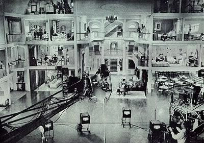
Talking about movies with invented sets made me think of one of my favorite movies, for which the director and star Jerry Lewis constructed the largest indoor film set of all time.
Jerry Lewis is kind of considered a joke now, if he's even remembered at all. But at one time he was an excellent comedian, and an incredible dancer. His old variety show with Dean Martin, which he did when he was my age, is really amazing to watch. When he became a director, though, he was surprisingly innovative. He invented a lot of tools used in filmmaking today, such as the picture-in-picture video assist. When he made his film The Ladies' Man, he constructed an elaborate sixty-room set and an elevated director's chair so he could go from room to room in one shot. And each of the rooms themselves were visually striking and color-coordinated in their own way.
Here's one of my favorite scenes, which introduces a character named "Mrs. Cartilage", who lives in "the forbidden room."
Tuesday, January 13, 2009
Movie Posters I want to write and draw comics, but I think movies are what I'm most passionate about as a fan. I also really like a lot of movie posters, and here are some of my favorites.
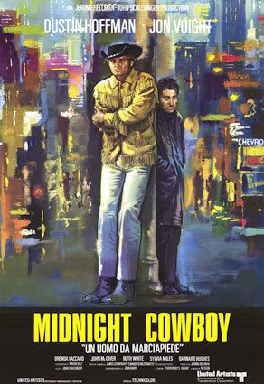
Midnight Cowboy
This is one of my top favorite movies ever, but that's not why I like the poster. I think I like it because New York tends to be depicted as a very grey, dark place in paintings. I grew up in New York and I never thought that was a good way to show it. I like this poster because it makes New York look bright and colorful and full of energy. The two main characters look a little overwhelmed, like they're stranded in all this light and movement- which is a pretty good summary of what the movie is. I also like how, despite the bright colors, the expressions on their faces are still grim and sort of hopeless. I think it's kind of a cheat to use faded, dark colors to convey those moods.
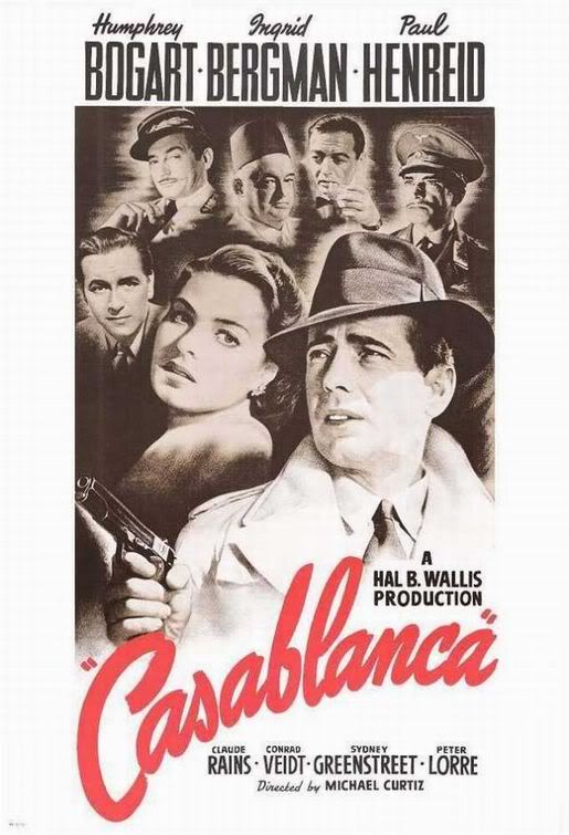
Casablanca
I really like these old style posters, which show the faces of the cast kind of floating in space. Its strange how little things like the way the title is written, and the slightly red tint of the whole thing, can make the image so unique, even if many posters might have a similar format. I also like Bogart's facial expression. He looks like he's running, or maybe deciding whether he needs to fire his gun or not. He looks kind of scared, even. Today in movie posters, if a guy is holding a gun, he looks determined and steadfast and badass. I think Bogart's face in this poster shows a lot more urgency and excitement. I think that modern posters of a guy with a gun walking grimly towards the viewer just look boring and static, which is why I like this one so much.
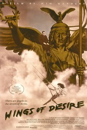
Wings of Desire
This is from a german film about a guardian angel who falls in love with a human. The way the angels are shown in the movie is really subtle and nice. They're just middle-aged men in dark coats, and you only see their wings briefly. I like how this poster makes the movie seem kind of epic, with the trapeze woman swinging through the clouds, and the statue rising up like it could fly. But then you notice the little man sitting calmly on the shoulder, like he's worried about something, and you focus on that, and it sort of brings you back down. That's sort of what the movie is like- it's about these big, epic things like angels and mortality and good and evil, but the actual story is very small and subtle.
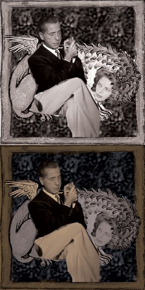
I thought I had posted a progress image of my third collage, but I guess I didn't. So here it is (I've chosen to do paintings of this one and the salamander one.)
I really like the idea of putting classic move stars and other celebrities with ancient holy imagery of the past. In freshman year drawing class, I did a whole series on this idea, except it was tarot cards.
I'm still working on the paintings and having kind of a hard time. I haven't oil painted in almost a year. Last semester I got very accustomed to using wax pastels on masonite. I sort of wish I could use that for this class too. I think I'd be a lot more comfortable. But this is a painting studio, so. Maybe I'll get better as I go on. I was never awesome at oil paint, but I think I was at the level just above "competent". Like, not good, but not at the "learned how to do this yesterday" stage. Oh well.
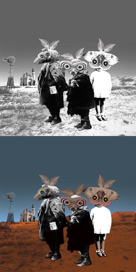
Here is the work in progress on one of the collages I'm doing for the first assignment. I decided to do them digitally since we'll be painting them and I feel I have more control this way. Here is the b/w version (I changed the photos I used to b/w, adjusted the contrast, then put them together) and the one with color added.
In the painted version I will try to make up the contrast to give it more of a sense of depth. I tried to do that with the color but it didn't work as well as I hoped. I'll also try to make it clear that the salamanders are on top of each other, not just on separate planes. I want this to look more physical than it looks now.
Paintings I Like
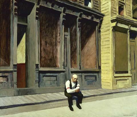
Sunday, Edward Hopper
This is one of my favorite Hopper paintings. I like how the man seems so isolated, but he doesn't seem particularly lonely or sad, he just looks like he's sort of enjoying a moment by himself. I also love the colors on the building behind him- the dark grey blue, and the sort of ashey red windows- and the way he's able to paint dark shadows but still imply kind of a bright morning.
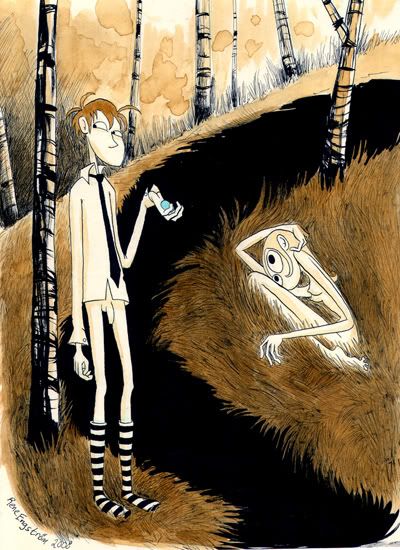
Coffee Sketch, Rene Engstrom
This was a watercolor sketch that was finished in coffee when the artist ran out of water. I like how otherworldly this image is, but how the character's expressions are still sort of normal. I also like how Engstrom can do features so simply but still convey so much. I love the strangeness of it, but also how simple the piece is, and how unfazed both the characters look. I also like the big dark space in between them. It might be a river, but I like to think of it as just a huge shadow that doesn't really make physical sense.
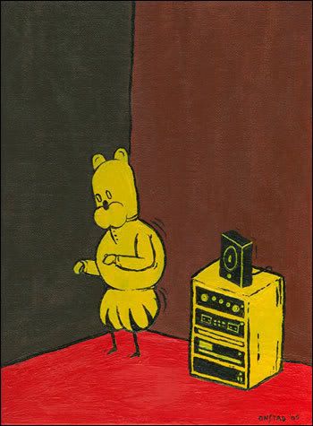
I Danced My Legs Down To The Knees, Chris Onstad
I love the colors, and how blocky and iconic this is. I like how the character appears to be dancing by himself, in a corner, just sort of bouncing up and down to the music. His expression is sort of content, but not particularly excited. It's like his mind is wandering and he's almost forgotten that he's dancing.
Hi! My name is Magnolia Porter and I'm a junior in illustration at Rhode Island School of Design. I'll be using this blog to talk about my work in the class I'm taking this semester, Painting the Constructed World. Currently I'm working on making collages to paint. I searched for images of people holding animals because I wanted to do kind of a Good Shepherd thing, and I came across this photograph from Life magazine. I think it's pretty striking, so I'm definitely going to use it.